
skip to main |
skip to sidebar
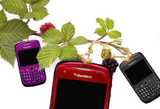
Here is a little sneak peek into what i'm working on right now. A magazine ad for blackberry. Just a class assignment, but I'm trying to kick some butt and do some great work. Been busy busy busy lately so now that I'm starting class projects again I'm thinking I'll be able to post some more interesting things. I love the classes i'm taking! Pretty soon we'll be taking on Carrara... a 3d program. RAWR 3D Design world... here i come!

The hunt is on... I'm in search for a brilliant Idea. I feel as though it is right at my fingertips just waiting for me to grab hold. I have decided to curb the idea of a creative thing every day. As classes start again and also trying to work on the side it is surprisingly hard to find time to do a creative thing every single day. However, I am transforming this creative energy into something else entirely. I am now using my blog as the creative workshop for my ideas, thoughts, and inspirations. I will be able to upload my current projects, progress, and perhaps ideas I would like feedback on. I hope to reach a broader audience, in turn getting more feedback, ideas and criticisms. I know this will take time, but I am thrilled to be starting something new and more beneficial than what I was trying before. I hope you guys are all in for the adventure!
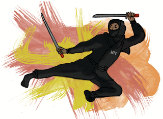
I love this technique for illustration. From the paper to photoshop and now here its a pretty fun process that I was introduced to during Art History class. We had a pop art and expressionism assignment, a little different than the look of this illustration. I decided to take the technique and make it my own of sorts.
For another creative post, I went browsing the goodwill just looking at the old decorations thinking what I could to make it work in my place. So if I can make up my mind with what I want to do with the rooms design wise I'll be posting some pretty cool things to spruce up your own living place.
TaTaForNow!

Monday, September 27, 2010
Typography world
Typography is the icing on the cake, the glitz, the glam. It can take a piece from good to great. I really love laying out typography, although I will admit I'm not as enthusiastic about it as other things. However, I do think it makes designed pieces look fantastic. I have a friend who loves loves loves typography and collects pieces that she loves. She is such an inspirational young woman, if everyone had an ounce of her passion I'm positive the world would be a better place. This piece I am sharing with you is a piece for class. I followed suggestions from professors and made some alterations so here is the final piece. ENJOY :)


Wednesday, August 25, 2010
LIttle sneak peek

Here is a little sneak peek into what i'm working on right now. A magazine ad for blackberry. Just a class assignment, but I'm trying to kick some butt and do some great work. Been busy busy busy lately so now that I'm starting class projects again I'm thinking I'll be able to post some more interesting things. I love the classes i'm taking! Pretty soon we'll be taking on Carrara... a 3d program. RAWR 3D Design world... here i come!
Thursday, August 19, 2010
The hunt is on

The hunt is on... I'm in search for a brilliant Idea. I feel as though it is right at my fingertips just waiting for me to grab hold. I have decided to curb the idea of a creative thing every day. As classes start again and also trying to work on the side it is surprisingly hard to find time to do a creative thing every single day. However, I am transforming this creative energy into something else entirely. I am now using my blog as the creative workshop for my ideas, thoughts, and inspirations. I will be able to upload my current projects, progress, and perhaps ideas I would like feedback on. I hope to reach a broader audience, in turn getting more feedback, ideas and criticisms. I know this will take time, but I am thrilled to be starting something new and more beneficial than what I was trying before. I hope you guys are all in for the adventure!
Thursday, July 29, 2010
91: Ninja Illustration

I love this technique for illustration. From the paper to photoshop and now here its a pretty fun process that I was introduced to during Art History class. We had a pop art and expressionism assignment, a little different than the look of this illustration. I decided to take the technique and make it my own of sorts.
For another creative post, I went browsing the goodwill just looking at the old decorations thinking what I could to make it work in my place. So if I can make up my mind with what I want to do with the rooms design wise I'll be posting some pretty cool things to spruce up your own living place.
TaTaForNow!
Thursday, July 8, 2010
90: Another Journal entry
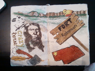
Here is another one of my travel journal pages. I though hey, I'm doing one for Colorado, might as well do one for Fort Robinson too... We are going to both places for vacation. I'm pretty excited! I'm hoping to fill the pages of my book/journal while we are there. I'm bringing some of my art supplies :)

89: Superhero ME
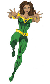
So I work with this super funny Brazilian woman named Vivian. She is the one who taught me css, and ever since 2 years ago she has been saving my butt! If I have a problem with css I call out a vivian SOS and usually she has the answer. :P so one day I decided I'm going to draw a superhero based on her... and so this is the result. hehe I sketched it, and then colored it in photoshop.

88: An update what?
Saturday, May 8, 2010
87: Mind trip CD design
Another school project, this CD is for a made up band called Blue Pinch. I am also designing a booklet insert, but it's not ready yet. What do ya think?
86: Abstract Expressionism
Thursday, April 29, 2010
85: Jack Black pop art
84: Pop art influence
Monday, April 26, 2010
83: A mind trip
Thursday, April 15, 2010
Tuesday, April 13, 2010
79: A editorial spread
Thursday, April 8, 2010
78: A bird feeder
77: A surrealist poster
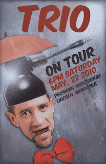
So last night I opened photoshop to start my surrealist poster for class... I had a few small ideas and thought ok this wont take too long. I also had a blog to write for work. However, I sat there for hours and hours making small little changes to my poster, and still did not have much to show for it. I started a few tutorials, and halfway through I decided that I didn't like it and so I hid those layers and started over. Finally it was 1230 and I still had nothing but a background and a few swooshes of the paintbrush on my page. I decided I had a creative block and went to bed. The next morning I woke up to the sound of my room mates alarm clock. SIGH... I had overslept about 40 minutes, and was late for class. In stead of jumping out of bed and freaking out, I decided hey I am already late might as well not stress myself out by rushing. So i got ready and went to class and started working on my poster yet again. I stared at the digital canvas and still no creative juices flowed. The well was dry. Later in the day I decided to just throw some random things into my file, and so I put the singer's head in a lamp fixture. This got me a little more on track, and so i started adding a few more odd mismatched things. Finally at the VERY end of the day this is what it turned out to be. For not having much creativity today, I think I produced something good.

Wednesday, March 31, 2010
76: A little dog logo
75: Another logo
This is another two logos for a wine websites. I only had a few hours to work on it, so I don't particularly like it too much, mostly because it doesn't fit perfectly with the subject. I was also working in black and white so there are no color added yet.
Tuesday, March 30, 2010
73: A little logo
Sunday, March 28, 2010
72: Some drawing fun
Thursday, March 25, 2010
71: Superheros!
70: Holocaust speaker series
Tuesday, March 23, 2010
69: A rose by any other name...
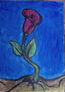
A little flower ATC I created today. marker and colored pencil. The effect looks alot better in person than in the photo. sort of like a stained glass effect. :D I'll have to play with this in the future. now off to watch LOST!

Labels:
Artist trading card,
colored pencil,
flower,
marker
Monday, March 22, 2010
68: yet another mushroom
66: A little shroom
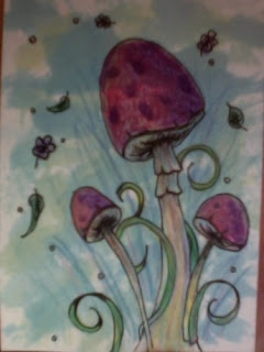
Here is a little mushroom artist card I made tonight. I think i'll give it to my room mate! colored pencil, watercolor, and ink

Labels:
Artist trading card,
mushroom,
pencil,
watercolor
Saturday, March 20, 2010
65: A little doodle
Sunday, March 14, 2010
64: AWw a heart for your drink.
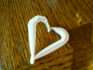
This little fella I made with 2 straws. With some cutting, bending, and burning this was the result. Here is the very cool tutorial. check it out.

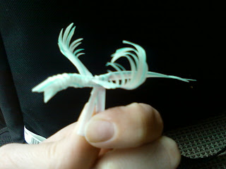
63: A bird in the straw
A cool little bird to go with your drink! I made him from a straw and some tricky folding. check out how to do it HERE. Although their bird is alot fancier than mine ;)

Thursday, March 11, 2010
62: Quick creative thing :D
Today I did a cool quick little play with a photo I found. :D Just messin around. I hope everyone likes it! no tutorial or anything. I wish I had time to catch up with everything, but I have been suuuuper busy lately. perhaps next week I'll be able to catch up a bit. So many finals... So little time. haha.


61: A series of abstract ATC's
Monday, March 8, 2010
60: A spring for spring!
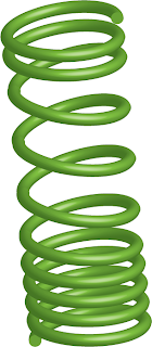
A cool spring I created in illustrator. This was done with a tutorial that you can find on this website.
Hopefully people have fun with this one! It doesnt take too long either.
Hopefully people have fun with this one! It doesnt take too long either.

59: typographic design
Dream! I was messing around in photoshop and this was created. I also uploaded it to redbubble so anyone can buy a tshirt with this on it. I started with just the type as a tutorial, but then diverted from what they were showing and then added some things of my own. This is the result. :)
Today i'll try to be ultra creative and upload as many things as i can!

Find the tshirt here:

Today i'll try to be ultra creative and upload as many things as i can!

Find the tshirt here:

Sunday, March 7, 2010
58: A typography portrait
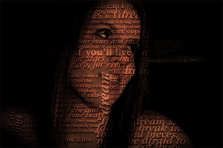
This is a typography portrait I made from a tutorial I found. Pretty nifty right! ill have to keep this one for maybe something ill make later. Hopefully everyone out there does a hop, skip and a jump and tries out the tutorial.
Find the nifty tutorial here: SUPER EASY TYPOGRAPHY PORTRAIT
Find the nifty tutorial here: SUPER EASY TYPOGRAPHY PORTRAIT

Thursday, March 4, 2010
57: dada inspired
56: An Illuminated manuscript
Monday, March 1, 2010
54: a little layout :D
Sunday, February 28, 2010
53: getting abstract
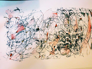
Today's project ( i forgot one yesterday :/ ill catch up. ) is some abstract art.
To get this effect i used black gesso and spread it on the back of some tinfoil and took a pencil then scribbled on it. after that, I used acrylic paint and markers, and i painted in parts of the piece. It does look more vibrant and better in person, but this photo will do for online. Hope you enjoy ;)
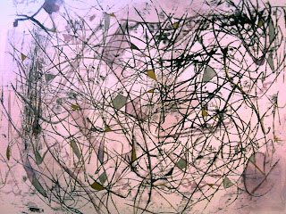
To get this effect i used black gesso and spread it on the back of some tinfoil and took a pencil then scribbled on it. after that, I used acrylic paint and markers, and i painted in parts of the piece. It does look more vibrant and better in person, but this photo will do for online. Hope you enjoy ;)


Friday, February 26, 2010
52: a doodle turned into an artist card
51: playing in photoshop
Thursday, February 25, 2010
50: Expressionism drawing
Followers
Blog Archive
-
▼
2010
(92)
-
►
March
(23)
- 76: A little dog logo
- 75: Another logo
- 74: ARRRRG TREASURE MATEY
- 73: A little logo
- 72: Some drawing fun
- 71: Superheros!
- 70: Holocaust speaker series
- 69: A rose by any other name...
- 68: yet another mushroom
- 67: abstract what?
- 66: A little shroom
- 65: A little doodle
- 64: AWw a heart for your drink.
- 63: A bird in the straw
- 62: Quick creative thing :D
- 61: A series of abstract ATC's
- 60: A spring for spring!
- 59: typographic design
- 58: A typography portrait
- 57: dada inspired
- 56: An Illuminated manuscript
- 55: Another self portrait
- 54: a little layout :D
-
►
March
(23)
Labels
About Me

- bcreative2010
- Well, I started this blog to try and create one piece of something creative a day. This plan did not work out too well... I have decided I would much rather have quality blog posts instead of quantity. SO with that decision this is now my creative canvas. I will spill all of my Ideas, inspirations, and creative processes to this one page. I hope with my words and ideas I can inspire others to awaken their creative minds as well. I'ld love to hear any suggestions, ideas, opinions or criticisms. So, here we go friends... Open the flood gates.


